|
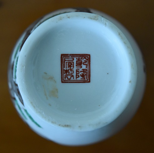
Subject:Re: Translation of Chinese inscription on vase marked with apocryphal Qianlong seal
Posted By: JLim Mon, Oct 16, 2017
Dear Austin
I have attempted to find a photograph that could help you with your inquiry (on your other thread) on how to identify transfer printed calligraphy. Unfortunately the calligraphy teapot I once had I have now sold, with only the attached inadequate photograph left to me.
In short, transfer printed calligraphy will be crisp and jet black to the edges, will frequently have missing portions, and will often be misaligned.
A human hand painting a line of text, or indeed decoration, will tend to self correct as the hand moves on, while a misalignment in transfer printing will continue to the end of the line mistakes and all, as I am sure you can appreciate. This is why, in signing correspondence, it is mysteriously more difficult to place your signature in a straight line if you use a stamp. The human hand will tend to correct itself unconsciously if misaligned while the stamp will not.
I suppose this is what is called the "human touch" - the self correction gives a warm organic look to the decoration.
In your case, the calligraphy on the previous vase and the black markings on this vase are not crooked, but they are dead black all the way across. A hand painted black line will demonstrate translucencies and brush strokes now and then - another organic sign of humanness I suppose.
You state that the nonblack parts of the designs are hand coloured. This is exactly why looking at all parts of the design is important. I myself was once fooled by a bat design in which the underglaze outlines of the bats were transfer printed, but then red enamel was crudely brushed over the top.
The principle could be stated as follows: ancient canons of art guided the hands of ancient artists, whereas modern artists, while quite capable, will be obliged to work to some sort of outline or stencil. This is because the old skills are lost (or very rare). You could think of it as layers of subterfuge:
1. first, having the entire design transfer printed, on based on old photographs. This is relatively easy to spot.
2. second, having the outlines of the design transfer printed, and having a human being brush in the rest of the design by hand. This can be spotted by careful collectors, but can be very difficult when the outlines are very thin, like in some Guangxu style famille rose.
3. third, having the outlines of the design stencilled very faintly on the porcelain and then covering the original stencilling completely with cobalt and enamel. This is difficult or impossible to spot directly, but can be sensed in the sterility or stodginess of the artwork.
4. finally, copying a photograph on to the porcelain with no transfer printing or stencilling at all. With a skilled painter this can be extremely hard to spot.
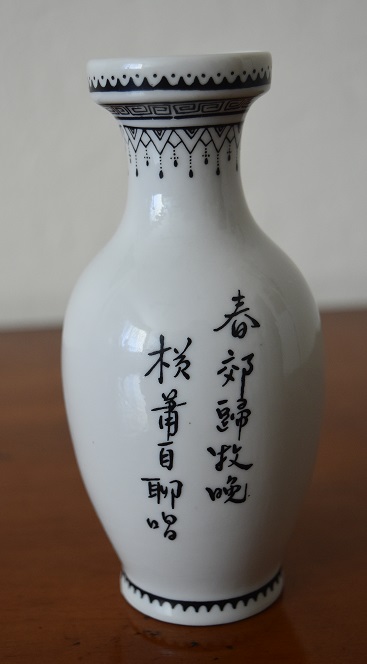
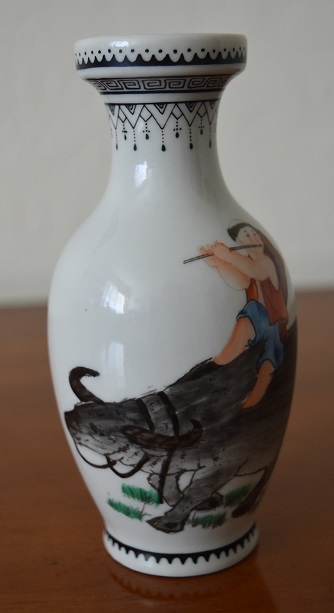
Your vases are at level 2 of the above; transfer printing for the outlines, but hand painting for the colours.
Kind regards
Jonathan


|
 Translation of Chinese inscription on vase marked with apocryphal Qianlong seal
  ( China & Japan ) - Austin - Oct 12, 2017 (07:55 PM)